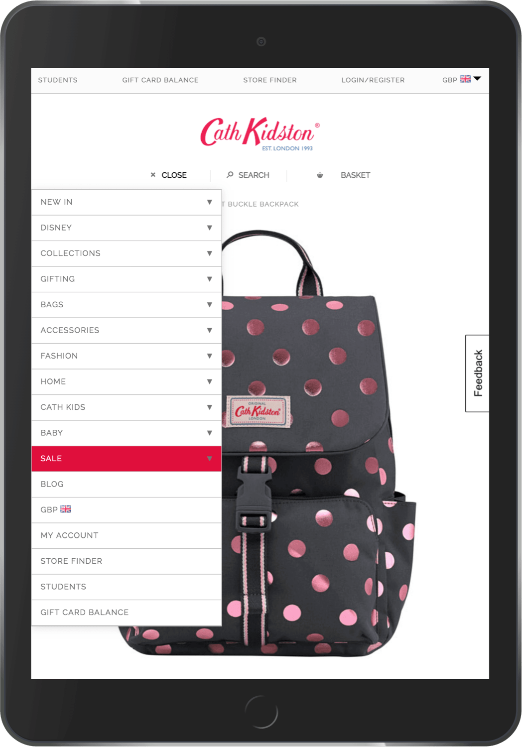
Cath Kidston came to us with their problem: they had two separate ecommerce sites - their standard desktop site and a mobile-optimised site - and wanted to merge them together, leaving a single site to manage that works flawlessly on all devices.
by John Norris
Cath Kidston wanted to stay with their current ecommerce provider, needed the whole site redesigned, and wanted the site live before the Christmas trading period. Quite the problem. Fortunately, at Dragon Drop, we love problems.
The Problem
Limited access to HTML
Doing all of this on their current platform meant we had very limited access to HTML. We had some access via their CMS but this didn’t allow us to change the main structure of the site.
Many stages to the project
Getting the project complete before Christmas trading meant we had quite a lot of risk to handle over only a few months. We had to bring the mobile website into the main desktop website, and implement a full redesign: lots of moving parts where things could go wrong.
Proposed Solution
Given the constraints of the project, we only had one realistic solution: take the current Cath Kidston desktop website, add additional styles so that the website is optimised for mobile, and then apply the new designs to create a uniform style across all mobile and desktop devices.
When all you have is CSS
A website is styled by a combination of its structure (HTML) and its styles (CSS). We knew in theory that our approach of restyling the current Cath Kidston website would work - as it is possible to restyle a website without changing the structure (just ask CSS Zen Garden) - we knew that there would be constraints, as you can’t do everything just by changing the styles. It’s also very difficult to be clear what is and isn’t possible as it depends on the specific structure, and the specific desired style. As such we knew that for this approach to work we’d have to have a very close relationship with the team at Cath Kidston to discuss any contentious areas, and decide on a suitable solution that both looked great, and ultimately was both possible and sensible to develop.
Prove the concept first
Before taking this approach to Cath Kidston we completed a comprehensive project internally to prove exactly how much flexibility we had to restyle their current website.
As expected we found a few areas of the website that weren’t as easy to style, and some new bits of structure that were essential for the customer to have the expected excellent experience on mobile. After all, we weren’t just aiming to find a solution that was possible, we wanted it to be as good as if we were building a mobile site from scratch.
After overcoming some of the major hurdles, we were able to send the team at Cath Kidston a pack of designs showing their current desktop ecommerce site with an early version of the mobile-optimised website styling.
Constant communication
Shortly after, we were comfortably settled into Cath Kidston’s Slack group, in constant communication with the team there, sharing ideas, and ironing out potential issues as soon as they arose from the development phase.
Solution
Phases help reduce risk
Throughout the project we were always aware that there was a level of risk: We were restyling both of their ecommerce sites (in the process of merging them togther, and applying the redesign), and adding additional supporting code to make the two merged websites work together but not affect each other. As such, early on it was decided that we should phase the project so that were delivering a manageable portion of change at a time.
The mobile styling was launched as part of phase 1, leaving the current website looking exactly the same on desktop, but mobile-optimised on mobile phones and tablets. We were able to prove that our approach for supporting websites worked, and allow the mobile styling to bed in while we worked on phase 2: the redesign.
While phase 1 ultimately meant the site was supported by two sets of styles - the new mobile stlying, and the current desktop styling - phase 2 meant we could make the Cath Kidston website completely responsive across all devices, served from one set of styles; less files, faster site speed, and a single source of truth for the redesign.
Ready for Christmas
A month before the Christmas trading period kicked in the project drew to a close with the redesign across both mobile and desktop going live. This meant we had a good few weeks to monitor the performance, and iron out any issues before their busiest period of the year.
The result?
Thinking outside the box
By focusing on the specific needs of the client, we were able to deliver a solution which gave them exactly what they wanted. The solution was thoroughly tested before proposal to ensure we knew exactly what was being offered, and ultimately that we could deliver the high level of quality work we’re only ever happy to present.
Great communication
We quickly developed a fast way of sharing ideas and solutions with the client. This was a tough project with unexpected problems at each turn, but great, clear communication helped ensure these problems were dealt with efficiently and weren’t allowed to slow us down.